Ryan and I had the opportunity to decide on our own short brief for this project. After chatting with our director about a few ideas that we had for this open-ended project, we eventually landed on creating an interactive Rive poster that educates users on a few select principles of design.
Our biggest hurdle throughout the whole process was trying to choose not only which principles we would highlight, but also how we would display them in such a way as to make them crystal clear to someone who is completely unfamiliar with the design principles. The exact principles and their depiction in this project changed throughout our process, eventually landing at the current final result through meticulous iterations and playtesting from our director.
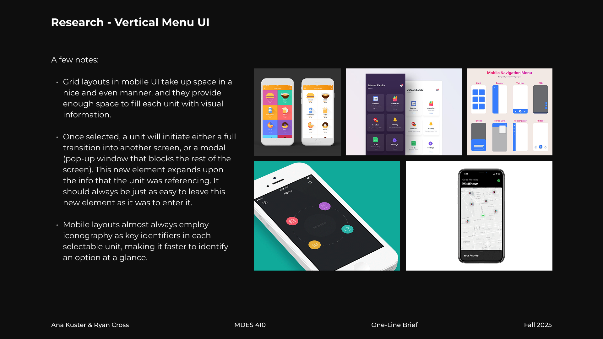
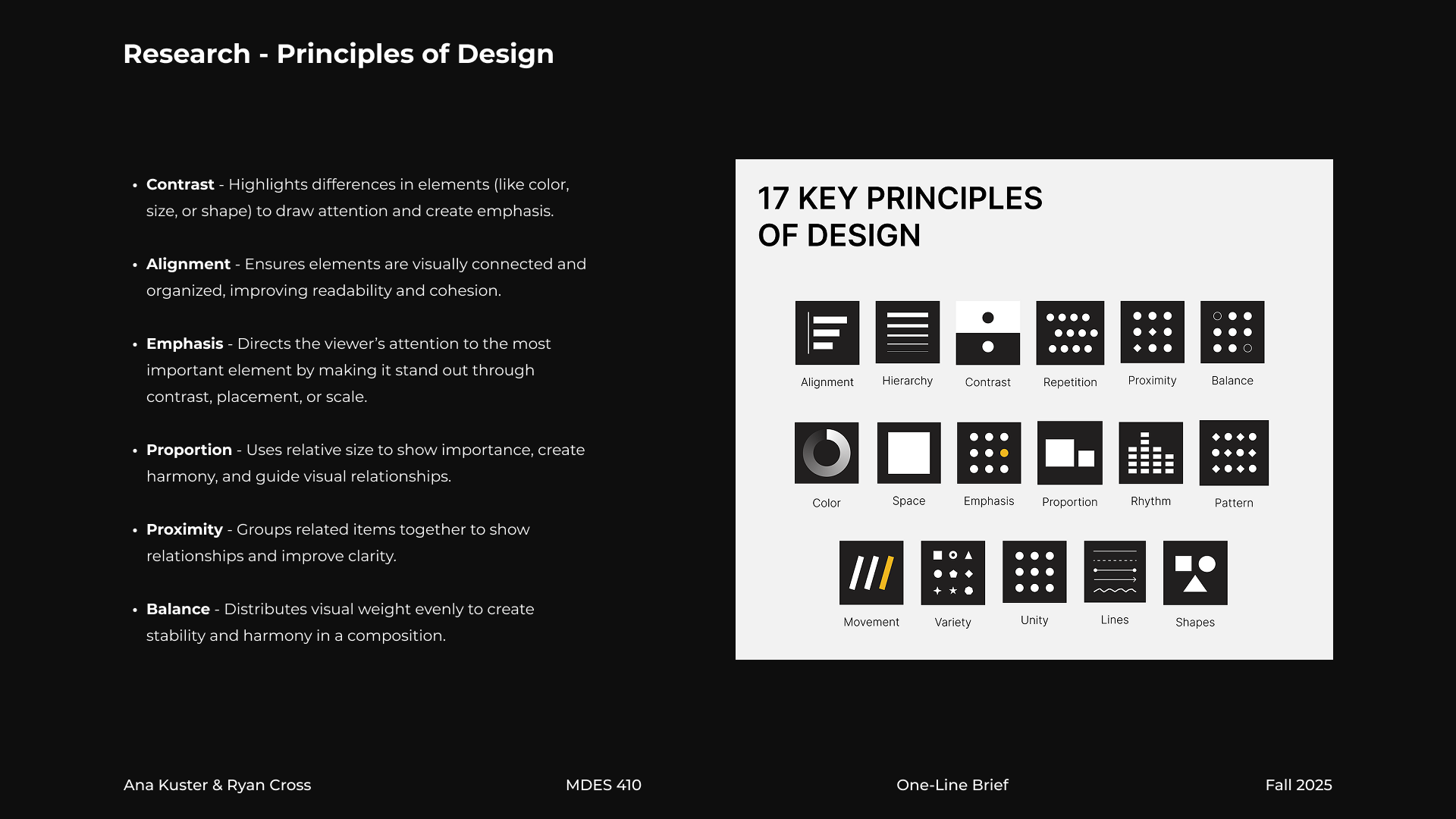
Research
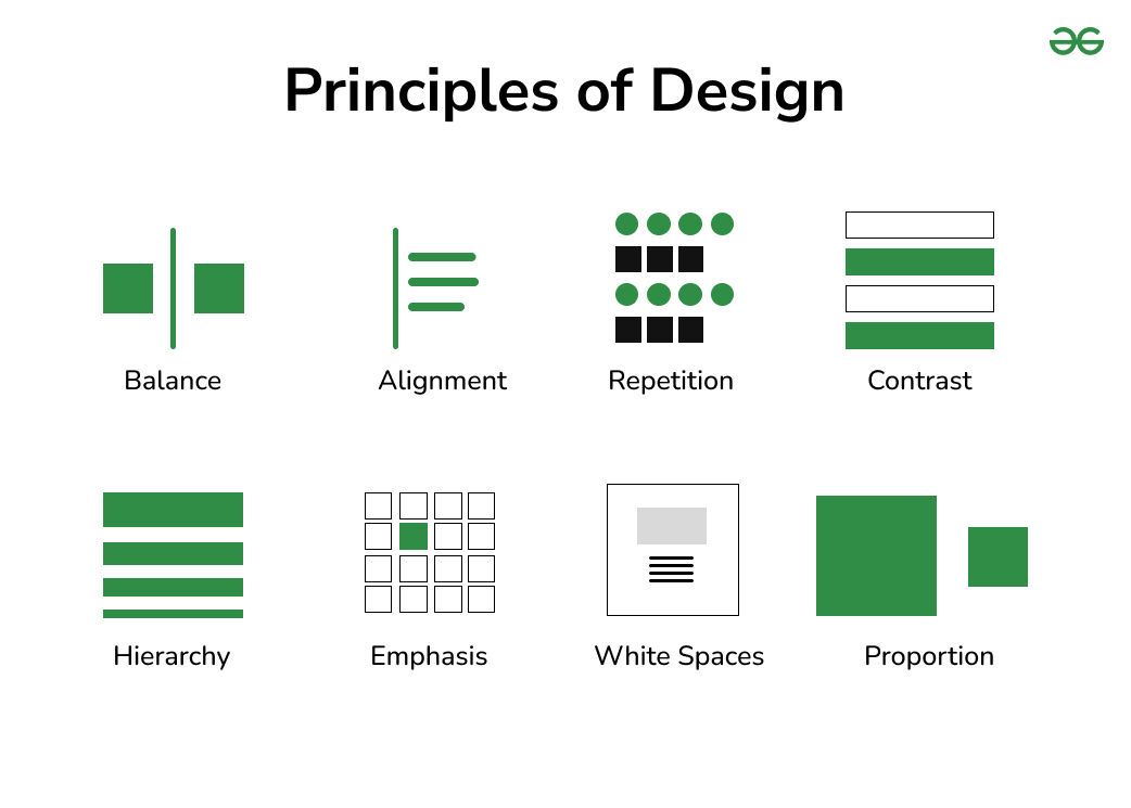
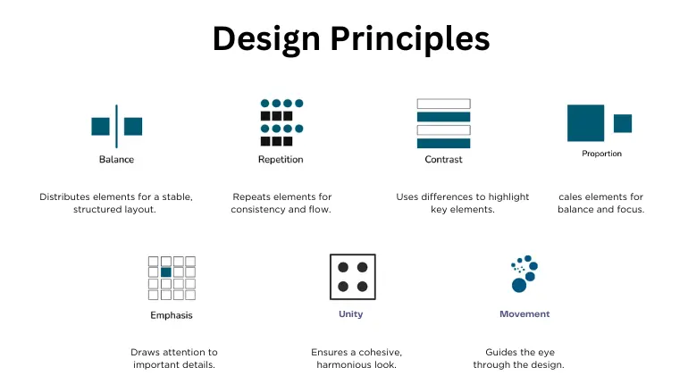
We deeply studied a wide variety of sources that explained the principles of design. One awkward obstacle we ran into was that pretty much everyone had a different idea of what the definitive list of principles of design should look like. The actual principles varied dramatically from one source to another, as well as the amount of principles they chose to feature.
Ryan and I cross-referenced our sources and decided to select some of the principles that featured most prominently throughout all our research. The exact principles in this project changed throughout our time working on it, but we eventually landed at the current final selection through meticulous iterations and playtesting from our director.
Pitch Deck
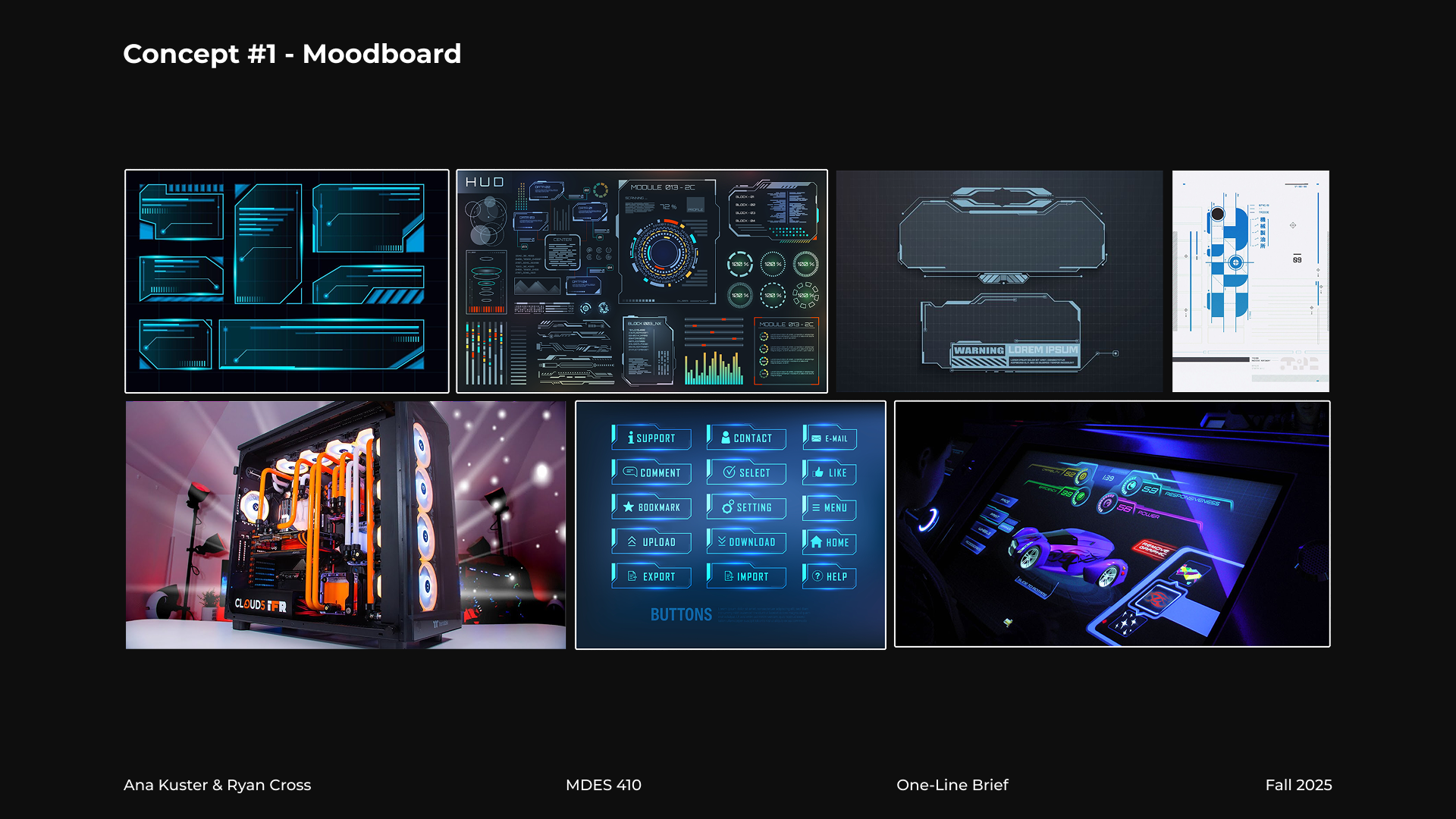
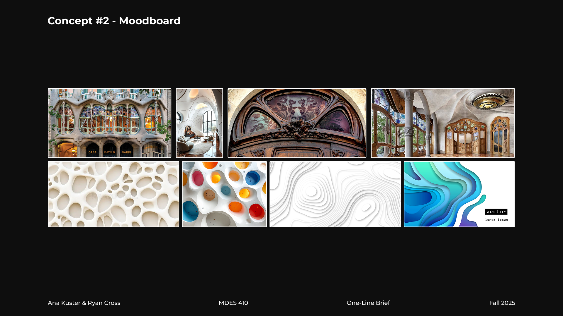
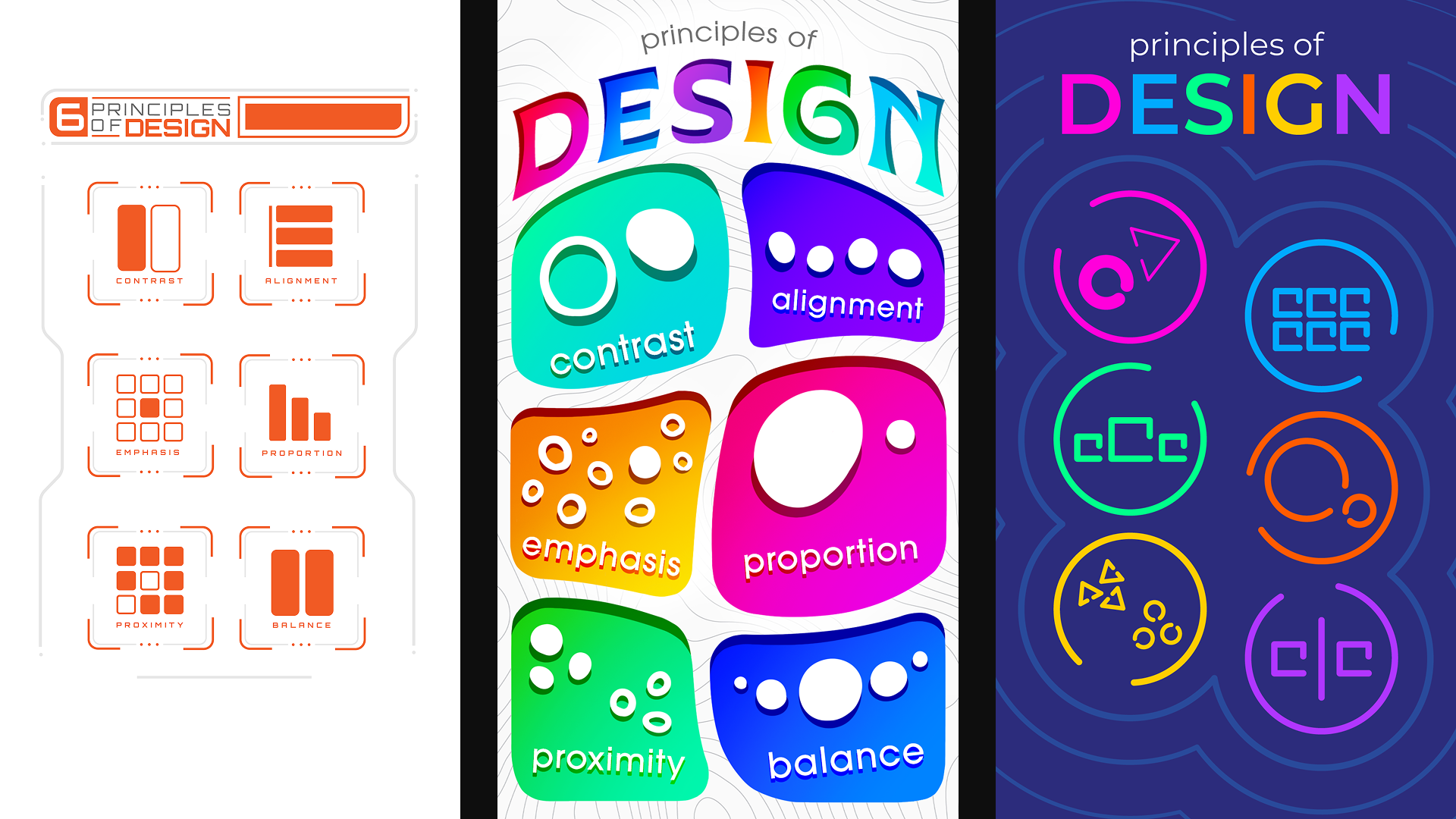
We worked together on several different design directions for our pitch, from Art Nouveau influences to high-tech digital aesthetics. Our focus was purely on what the main menu would potentially look like.
Our director pushed us to consider these directions from a far more basic angle in order to let the principles themselves shine through. Our main note was that the pitched styles distracted too much from the basic point of showing the principles and educating the user on what they are. With this in mind, Ryan and I got to work on revising these frames.
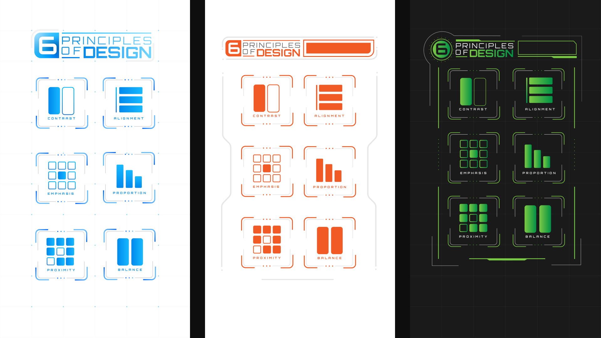
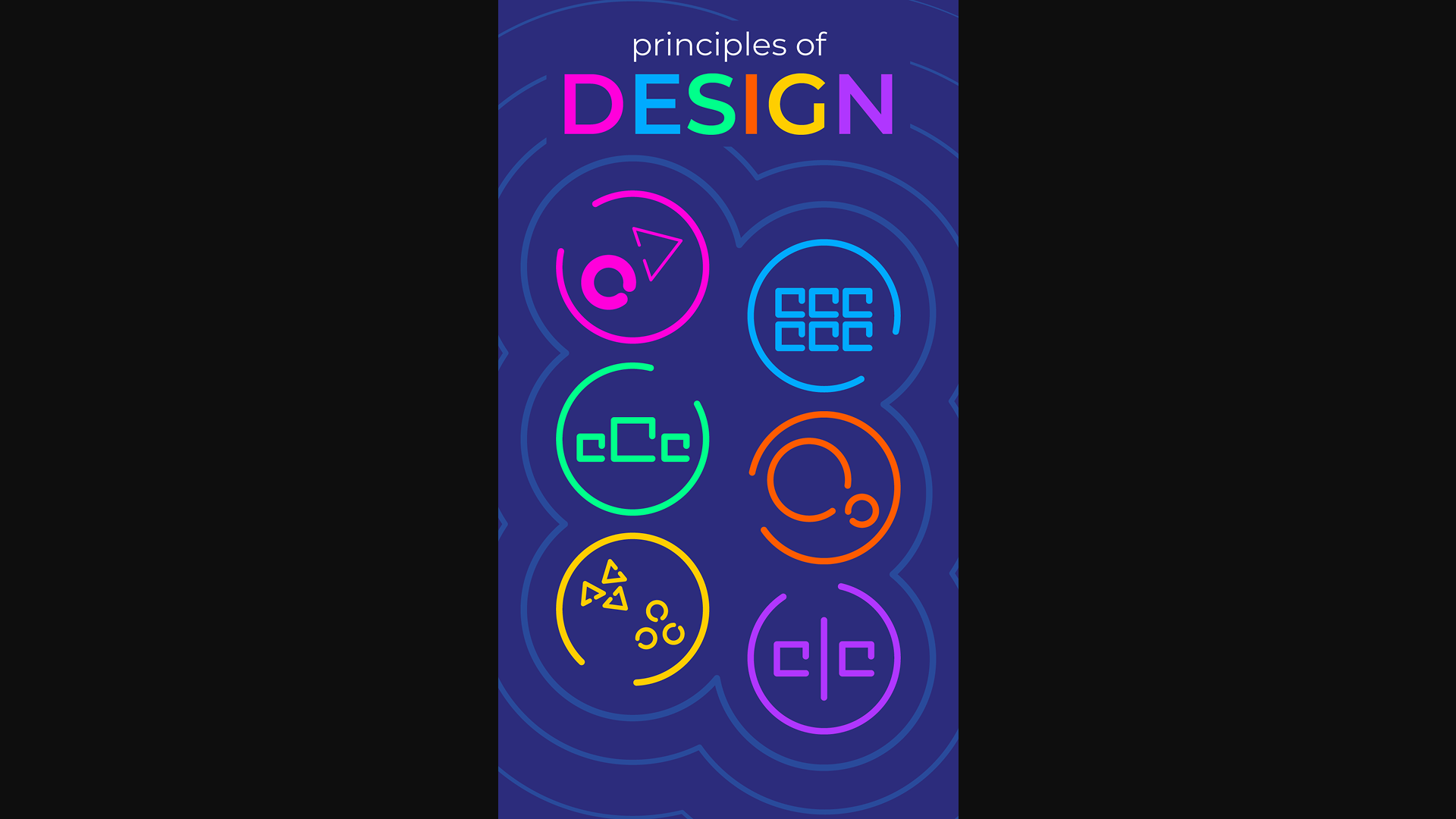
Final Direction
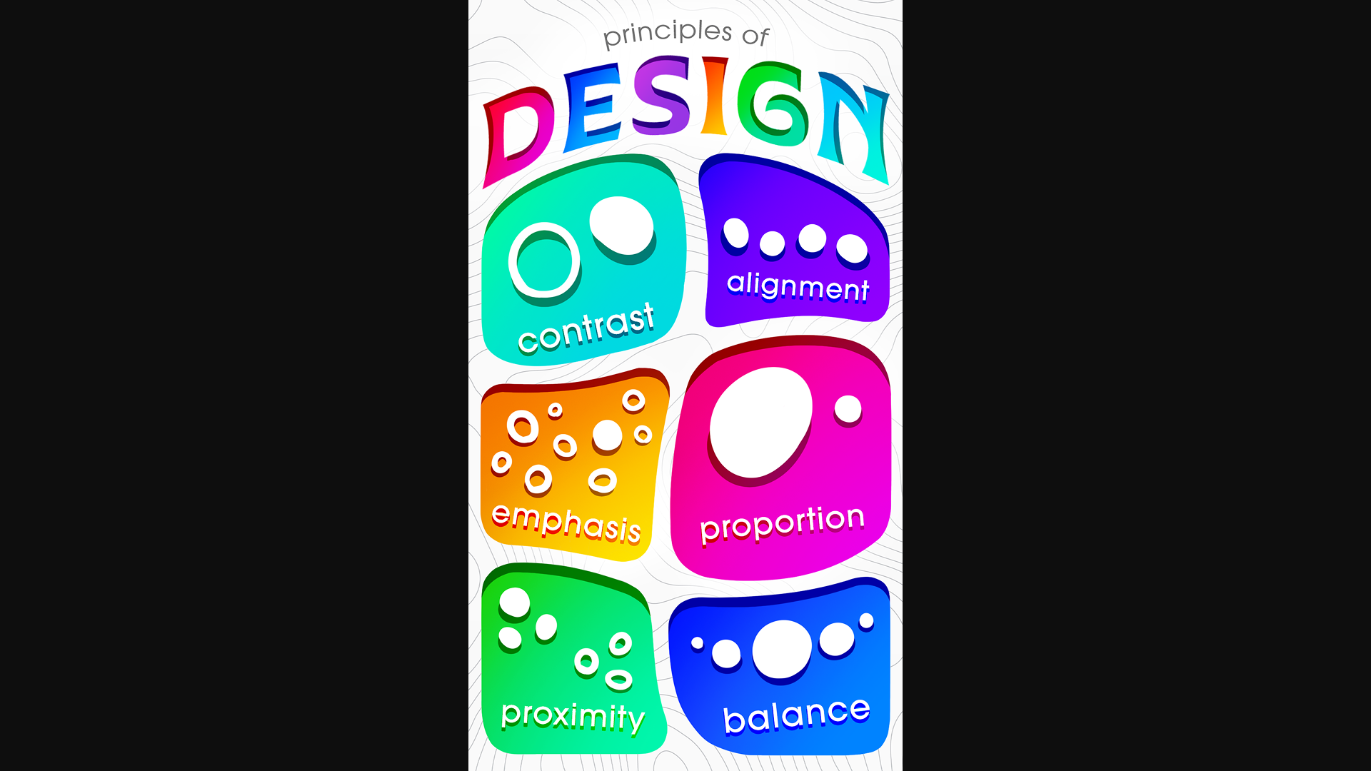
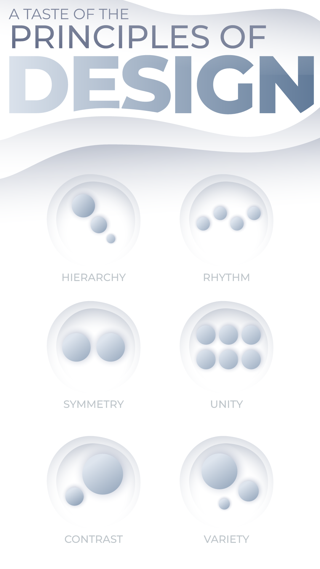
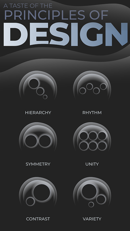
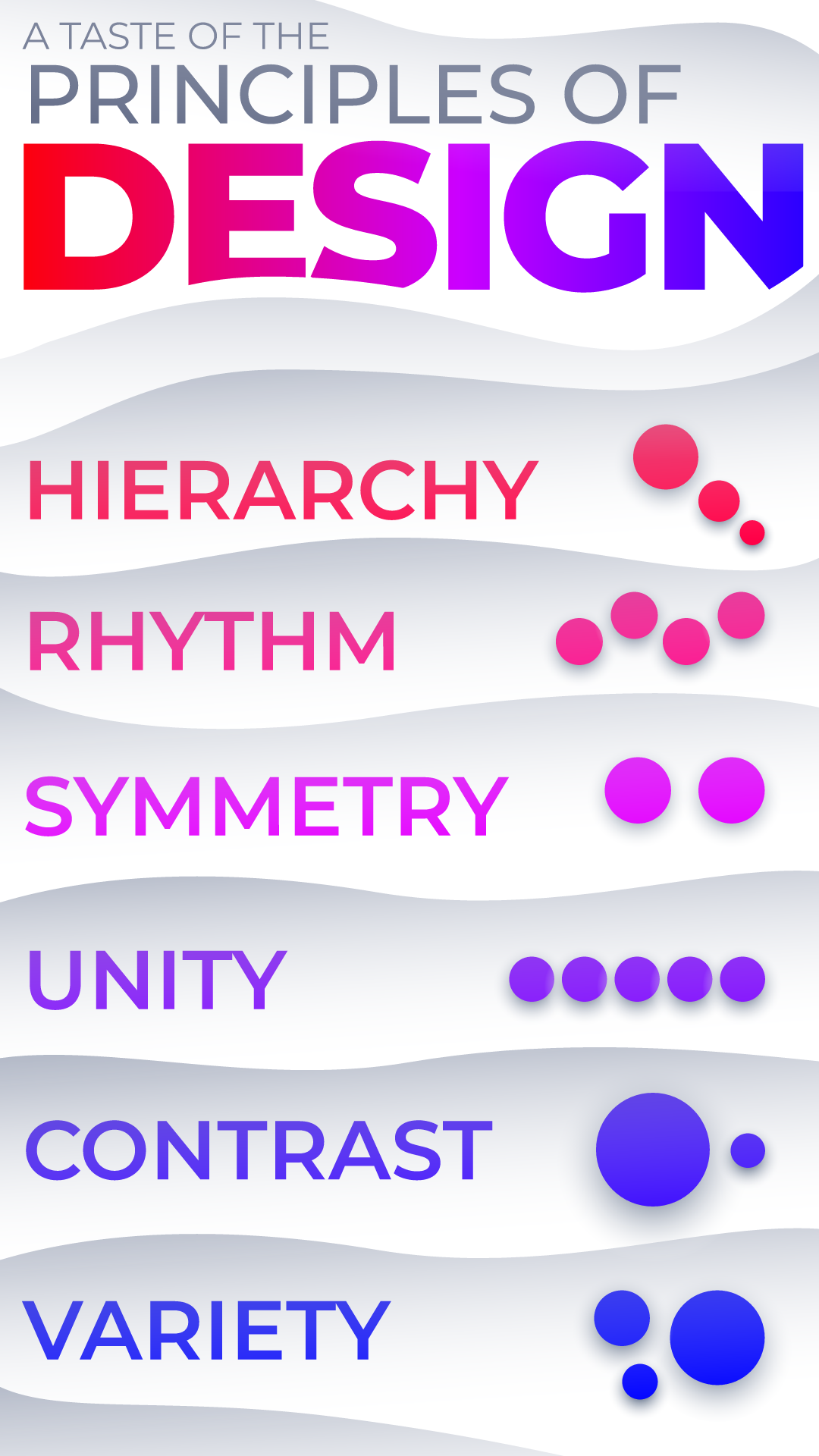
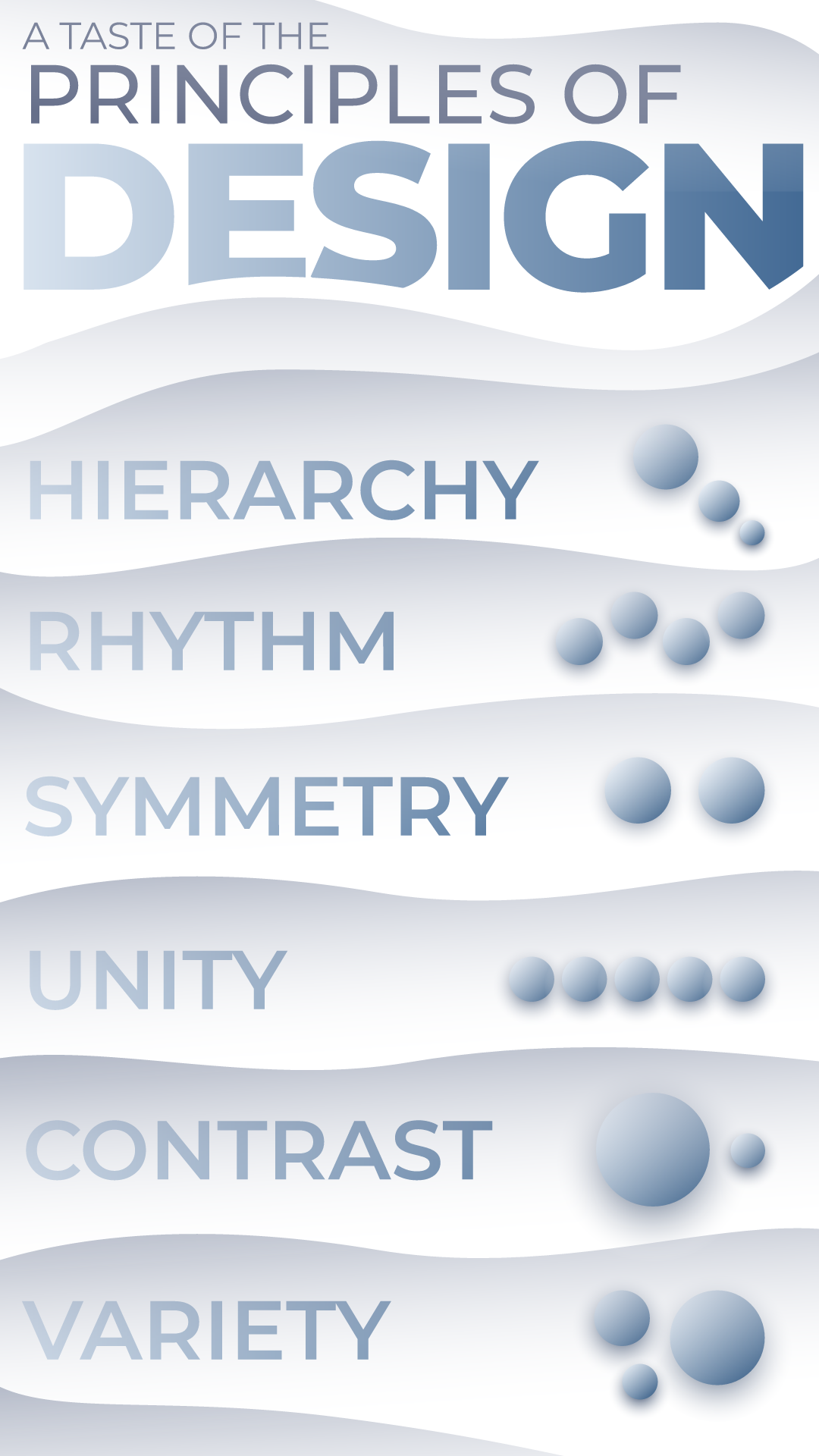
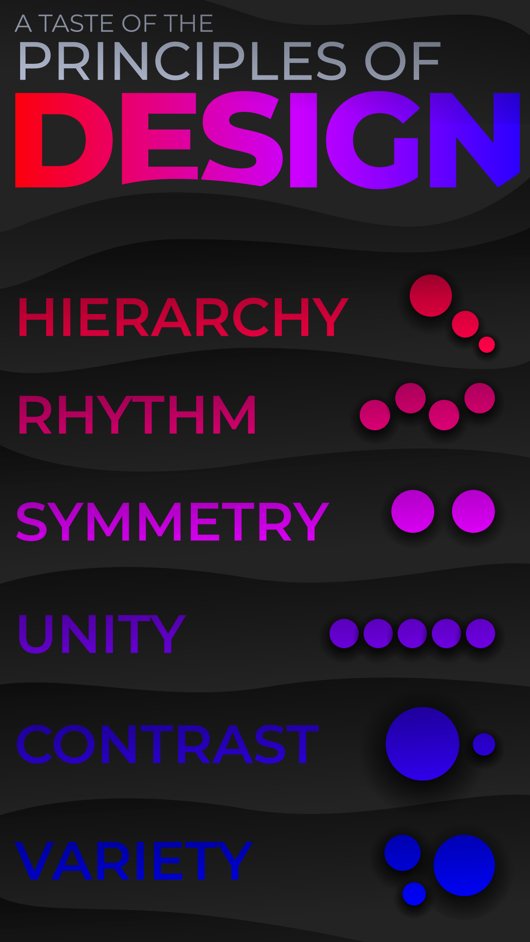
After going through several design directions, our director started gravitating strongly towards a soft and wavy reinterpretation of our earlier Art Nouveau-inspired frame. Ryan and I worked on several color variants for this new style, as well as different layout options for the principles. Eventually, we settled on a "silver foreground, black background" color style, and our director preferred the grid-based layout with each principle as a round unit. With a design direction finally locked down, we went straight into the next phase: incorporating interactivity.
Rive Prototype
I have a habit of starting my Rive tests in any project with a crummy greyscale prototype, and this one was no different. It's a wonderful way to get to the interactivity as quickly as possible without worrying about visuals at this stage. In this case, I wanted to experiment with how the screen transitions and principle switch toggles would work.
I reused the same technique I've previously applied to my screen transitions in Rive: set up each "screen" as a component (which is comparable to a precomp in After Effect) and then place instances of all components within one master artboard, which would control the scale of each component in order to create the illusion of going from one screen to another.
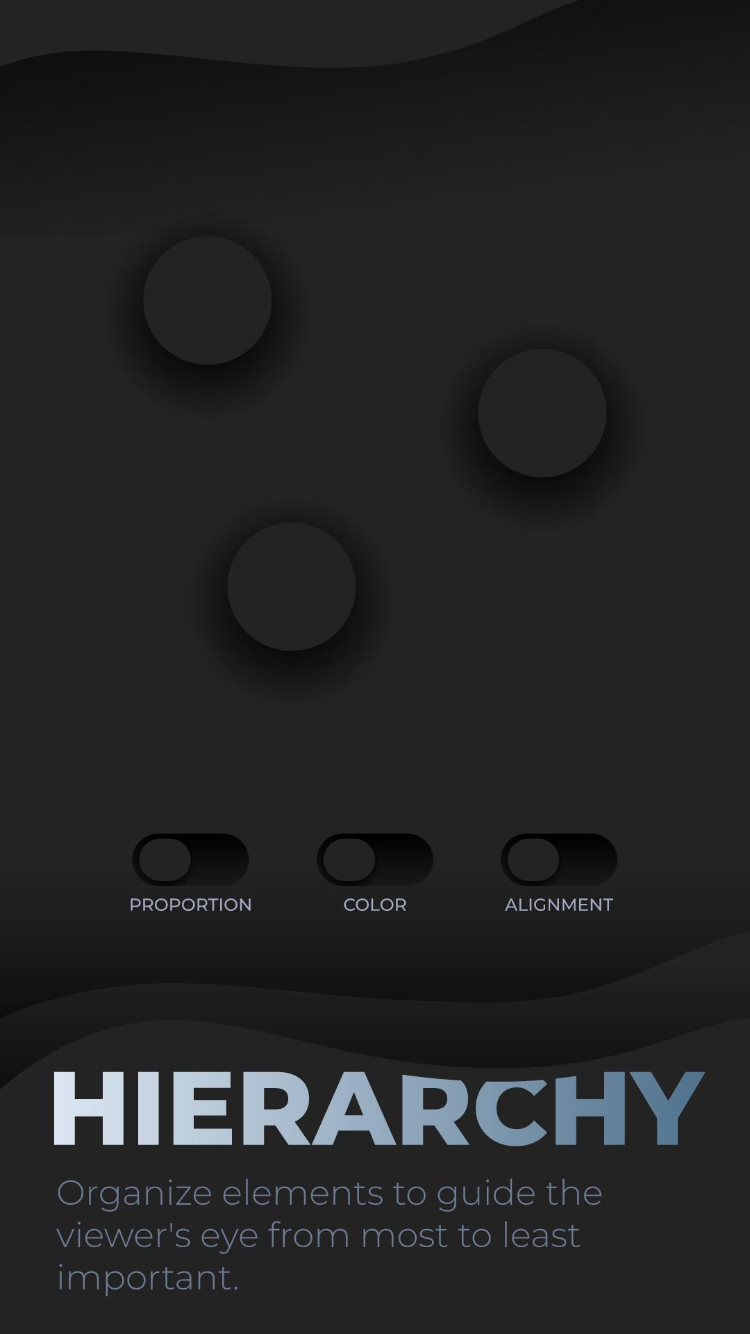
The principle switches toward the bottom of the screen contain invisible "hitboxes" which listen for a click or tap. When the input is registered, a Boolean tied to that specific switch is toggled, which triggers a change in the circles' position, scale, and/or color depending on the switch that was activated.
The State Machine and Data Binding setup that this prototype used was replicated almost exactly for the final file.
Final Rive File Walkthrough
Takeaway
With this project only being three weeks long, we didn't have enough time to delve into every possible design principle, which would have probably resulted in a very intricate and full-fledged experience. With more time, perhaps each principle would have its own bespoke set of controls to make them truly unique in how they're presented to the user. Still, I'm quite satisfied with how this turned out.
I was able to treat this project as an opportunity to begin establishing my own best practices for Rive file handling in order to be as quick and efficient as possible. Knowing that each principle would have a similar set of controls, I purposefully grouped and layered elements in the file's hierarchy so that everything would be extremely easy to duplicate. My prior experience with Rive, as well as my experimental but successful file preparation techniques, allowed this somewhat complex Rive file to be programmed in less than a day.
This project has further boosted my speed and confidence in Rive, as well as my obsession with it. This tool has enabled me to create interactive experiences with a deep focus on animation, and I'm extremely grateful for that. I'm looking forward to taking on far more complex Rive projects in the near future!